WELCOME

Welcome and thank you for visiting!

The charts, graphs and comments in my Trading Blog represent my technical analysis and observations of a variety of world markets...
* Major World Market Indices * Futures Markets * U.S. Sectors and ETFs * Commodities * U.S. Bonds * Forex

N.B.
* The content in my articles is time-sensitive. Each one shows the date and time (New York ET) that I publish them. By the time you read them, market conditions may be quite different than that which is described in my posts, and upon which my analyses are based at that time.
* My posts are also re-published by several other websites and I have no control as to when their editors do so, or for the accuracy in their editing and reproduction of my content.
* In answer to this often-asked question, please be advised that I do not post articles from other writers on my site.
* From time to time, I will add updated market information and charts to some of my articles, so it's worth checking back here occasionally for the latest analyses.

DISCLAIMER: All the information contained within my posts are my opinions only and none of it may be construed as financial or trading advice...please read my full Disclaimer at this link.

Dots

* If the dots don't connect, gather more dots until they do...or, just follow the $$$...

Convertible at Beach

Convertible at Beach

ECONOMIC EVENTS

UPCOMING (MAJOR) U.S. ECONOMIC EVENTS...

***2026***
* Wed. Sept. 16 @ 2:00 pm ET - FOMC Rate Announcement and @ 2:30 pm ET - Fed Chair Press Conference

*** CLICK HERE for link to Economic Calendars for all upcoming events.

Thursday, February 08, 2018

US Major Indices Enter Correction Territory on Unprecedented Monthly Volatility Spike

After another volatile day of trading on Thursday, all of the nine US Major Indices closed down hard and four are officially now in 10% correction territory (with the others closely behind), as shown on the following graph, which shows their losses since prices peaked in January.


Here's a look at their 6-month daily chart. All of them are below their 50-day moving average.


The following monthly chart of the SPX:VIX ratio shows that the trading range of February's candle is the largest, in history, after only 6 trading days. Price has now entered into the "uncommitted zone" and is hovering just above the "fragile zone." Historically, price action on the SPX consists of wild, aimless/trendless and very volatile swings when this ratio remains below 150.


World Markets, in general had a bad day on Thursday, as can be seen from the graphics below.

Source: CNBC.com

Source: Indexq.org

Additional graphics show today's activity for US Major Indices, Sectors and Futures Markets...

Source: Barchart.com

Source: Finfiz.com

Source: Barchart.com

Finally, the MSCI World Index has dropped to its external Fibonacci retracement level of 1.618%, as shown on the monthly chart below. It has also fallen back into a long-term uptrending channel, after briefly popping above. A drop and hold below that level (2032.74) could send all world markets
into a tailspin.

Keep an eye on the 60 level on the SPX:VIX ratio, as a drop and hold below could spark panic selling in the SPX. In any event, watch for more volatile swings as long as it holds below 150, and, especially, 100.


Trendline Apex Tagged by U.S. 10-Year Treasury Yields

U.S. 10-Year Treasury Yields have now tagged the apex of two rising intersecting trendlines (the high of February's candle) and is currently trading a bit below, as shown on the following monthly chart.

It will need to break and hold above this apex around 2.885, first, before reaching 3% at some point.

The momentum indicator is above the zero level, and, as long as it remains above, it hints at higher rates ahead on this longer term timeframe. However, the RSI is nearing its prior all-time high of 67.7510 set in January of 2000, so we may see quite a tug of war playing out over the coming days/weeks.

If we see a spike in RSI over and above that prior high, look to see whether momentum makes a higher swing high. If so, that could very propel this to 3%, or higher. If not, then I think price will move sideways for awhile.


Wednesday, February 07, 2018

What's Ahead for Tesla (TSLA)?

I have a question for Elon Musk (of course it's silly, but a little levity never hurts). Where's the next charging station located for his space-bound Tesla Roadster👀


The following news clip and videos from TheGuardian.com describe yesterday's spectacular space launch...


At the moment, price on this weekly chart of Tesla (TSLA) is embedded in a large downward-sloping consolidation zone. As long as it stays above its channel median, and as long as the momentum indicator remains above the zero level on this timeframe, there is a chance we could see it recover to retest prior all-time highs, and, even, push higher. Otherwise, a drop and hold below these levels could see it drop to the channel bottom around 280.00, or lower.

Perhaps yesterday's successful launch will be the shot in the arm to resuscitate this stock.


Tuesday, February 06, 2018

Equifax: Head & Shoulders Formation

I last wrote about Equifax (EFX) here.

A large bearish head and shoulders formation is developing on the monthly chart below. If this pattern plays out, price would, eventually reach its downward-sloping neckline, around the 60% Fibonacci retracement level at 73.83. Longer-term major support sits well below at 40.00. The momentum indicator is at a new all-time low...signalling further weakness ahead.


BITCOIN'S Parabolic Rise & Fall

My previous posts about BITCOIN can be read here.

It has risen and fallen in a classic parabolic manner in the space of just a few short months, and here's where it's currently trading on a monthly chart (as of 12:45 am ET on Tuesday).

There's not a lot more that I can say about it, other than to repeat what I mentioned in my last article, which was that if it broke and held below 10,000, a measured technical move would send it back to its all-time low of 4.2...which is where major support sits.


Monday, February 05, 2018

US Government Shutdown Looms on February 9th as World Market "SELL" Signal is Triggered

* See UPDATES below...

Another U.S. government shutdown looms this week on February 9th.

Will it...won't it? That's the $64,000 question as more volatility is in store for markets.

Given the fact that there are great political divides over a variety of policies, increased volatility in the markets, and, now, the information that's being revealed that may determine whether or not civil and/or constitutional rights were violated in the months leading up to and after the 2016 presidential election (and any political and/or legal fallout that may occur), will only add to the increased odds of chaos ahead, making future events less predictable.

Layer on top of that, the unlikely chances of any additional fiscal stimulus economic benefits that would be generated by programs such as infrastucture spending, over and above that which will trickle out into the economy from last year's Tax Cuts & Jobs Act, to offset a resulting increase in inflation and interest rates.

Furthermore, if we see a collapse in the US $, these odds will increase dramatically, so keep an eye on it, as I've mentioned recently here.

As well, further world market weakness, that we've seen of late, is noted on the daily chart of the World Market Index below (as of Friday's close). A new "SELL" signal has also been generated by the RSI, MACD and PMO technical indicators. Major support sits at 2000.


The following heat map shows how world markets are trading as of 12:20 pm ET today (Monday).


There's no doubt that a lot more uncertainty lies ahead...so, buckle up!

* UPDATE February 5  @ close...

Sunday, February 04, 2018

S&P 500 Index: Major Support at 2500

Just a quick heads-up to mention that major support for the SPX sits between 2525 and 2485, as shown on the following daily and monthly charts.

There is a convergence of the 200-day moving average with two trendlines at 2525 on the daily chart, and, more importantly, a convergence of two external Fibonacci retracement levels with the +1 standard deviation level of a long-term uptrending regression channel at 2485 on the monthly chart.

If we see a major sell-off in equities, we may see price, ultimately, fall to somewhere around 2500 (a 10% drop from Friday's close) before it stabilizes. Keep an eye on the FAANGs +5, as I more fully outlined here, as well as the 10YRT, as I described here and here. Further weakness in the FAANGs + 5, together with continued rising rates in the 10YRT, could very well propel such a drop in the SPX to that level, or lower.


Saturday, February 03, 2018

FAANGs +5: Two New Risky 3x Leveraged ETNs

On January 23 of this year two new 3x leveraged ETNs were launched, comprised of FB, AMZN, AAPL, NFLX, GOOGL, BABA, BIDU, NVDA, TSLA & TWTR, and their descriptions are as follows...
  • FNGU is an exchange traded note that tracks 3x the daily price movements of an index of US-listed technology and consumer discretionary companies. The index is highly concentrated and equally weighted.
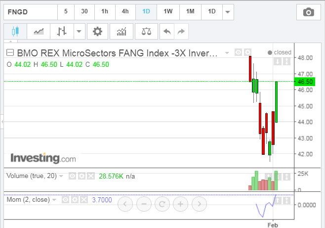
  • FNGD is an exchange traded note that tracks 3x inverse the daily price movements of an index of high concentrated and equally weighted US-listed technology and consumer discretionary companies. The note uses derivatives to achieve its -3 exposure.
They are both highly risky investments and are very thinly traded.

The following 1-year daily thumbnail charts of these 10 stocks show, at a glance, where they're at relative to their respective trend, as well as 20 & 50-day moving averages, price support/resistance levels, and which ones are leaders or laggards over this time period.


These next charts show market action over the past two months, and, in particular, some hefty profit-taking that occurred during the past week(s).


The following two charts of FNGU show price action from its launch to this past Friday's close. The first chart is a daily one and the second one is a weekly.


The following two charts of FNGD show price action from its launch to this past Friday's close. The first chart is a daily one and the second one is a weekly.


All four charts illustrate the volatility that is underlying these two ETNs, inasmuch as they're both almost back to where they started, with most of the prior week's profits wiped out in the process. 

While they may be highly risky to trade, they may have some value to traders interested in any of the 10 underlying stocks. Their movement can be monitored to gauge where these stocks may be, generally, headed, as well as their current market sentiment. 

At the moment, any prior upward (bullish) bias has cooled. Keep an eye on the momentum indicator shown on the daily charts. I've selected a fast-moving length of 2 days for now, until more time passes, which will allow for an implementation of the default setting of 10, to assist in this regard.

Weekly Money Flow: Week 5 January 2018

The following 1-year chart grids and 1-week gains/losses graphs show, at a glance, where a variety of major world markets are trading and how much they gained/lost this past week. They are presented without individual commentary. The charts will, however, simply show, at a glance, minor and major support/resistance levels in the form of 20 & 50-day moving averages and price swings/consolidation levels, as well as which markets are leaders or laggards in their performance during the 1-year period.

For my detailed analyses that I've completed over the past couple of weeks, especially this last week, on some of these markets, you can review them on my Blog at your leisure.

Major U.S. Indices


Friday, February 02, 2018

Equity Volatility is Nearing "Critical Mass"

I last wrote about the SPX:VIX ratio in my post of January 31.

The SPX continued its plunge (that began on January 30) and closed near its low on Friday (spiking the VIX to a new daily swing high), as noted in this post.

The following monthly chart of the SPX:VIX ratio shows that price closed well below, what was, major support of 200 and is hovering just above the 150 Bull/Bear Line-in-the-Sand or "critical mass."

Furthermore, the momentum indicator has fallen below the zero level, hinting of further equity weakness to come in the longer term.

If this ratio drops and holds below 150, no doubt we'll see an acceleration of equity selling and much higher spikes in volatility. In any event, we'll continue to see some wild swings as long as this ratio stays below 200.


As well, watch for a bearish moving average crossover of the ratio 5MA & 20MA on the following monthly chart -- which shows the SPX in the upper half and the SPX:VIX ratio (in histogram format with these 2 moving averages) in the lower half -- if the ratio were to drop and hold below 150, to confirm continued (and, potentially, panic) selling in the SPX.


Stocks vs. Commodities: Will Traders Dump All?

Looking back at a longer-term monthly view of the S&P 500 Index (SPX) compared with GOLD (GC) (blue bars) and WTIC Crude Oil (CL) (pink bars), we saw a broad correlation among these regarding rallies and pullbacks...until 2011 when the bounce in GC and CL stalled and, ultimately, sank in mid-2014, especially CL when it plunged to (just below) post-financial crisis levels in January of 2016.

As I write this post at 11:50am ET on Friday, we see that, while the SPX is just below all-time highs, GC faces major resistance at 1350, and CL is swirling around 65.00 (major resistance/support).


As shown on the following daily chart of GC (green & red) compared with CL (blue & pink), price in these two commodities has stalled the past couple of weeks, and is down, again, today.


Given the "shock drop" that began in the SPX on Tuesday and which continues today, as shown on the daily chart below (with the VIX overlayed on it), if GC and CL continue to decline next week, and beyond, this could signal the beginning of a pullback in the SPX, and equities, in general.

Keep an eye on the SPX:VIX ratio as one tool that can be used to gauge such a possibility/probability, as I more fully described in my post of January 31.

As well, the details I outlined in my post of January 27 regarding CL are worth monitoring.


P.S. And, this article was just released from Bloomberg.com...


P.S. How the SPX and VIX closed today (daily chart)...


...and how GC and CL closed (daily chart)...next week should be interesting.


Wednesday, January 31, 2018

January 2018 Market Wrap-Up

* See UPDATE below...

We could see a tepid recovery of yesterday's "shock drop" in equities (as I described here), until the Fed's next interest rate hike (possibly in March), to send Major Indices to levels somewhat higher than their recent all-time highs. But, we'll likely see higher volatility remain in play and, possibly, more wild price swings, until then.

As I promised in that post, here's January's month-end summary.

DOW 30 INDEX

The first daily chart shows that the Dow 30 Index failed to fill yesterday's gap down and closed 100 points above its low of the day.

Momentum remains above the zero level, but has dropped dramatically after failing to rise to a new high when the Dow made its last new high on January 26. It's an important level to hold in support of such a recovery. Otherwise, a drop and hold below zero would see further weakness in the Dow.


S&P 500 INDEX

The next daily chart shows that the S&P 500 Index failed to fill yesterday's gap down and closed off its low of the day. The VIX is overlayed on this chart and price remains above near-term support of 13.00.

Momentum remains above the zero level, but has dropped dramatically after failing to rise to a new high when the SPX made its last new high on January 26. It's an important level to hold in support of such a recovery. Otherwise, a drop and hold below zero would see further weakness in the SPX.

Tuesday, January 30, 2018

10-Year Treasury Yields on the Rise

The following two monthly charts show that 10-year Treasury Yields ($TNX) are on the rise.

The first chart shows that it has popped above the upper edge of a very long-term downtrend channel and is headed for near-term major resistance at 30.00.

The second one shows that price has broken above a -1 standard deviation level of a long-term downtrending regression channel.

Whether or not 30.00, if reached, would have any real negative impact on equities, may be looked at in context as to where it was at its height in 2007 (just prior to the financial crisis) and the economic conditions in play at that time, compared with current conditions (as well as the financial soundness of the major banks).

In any event, we may see some volatile swings until, either, this very long-term downtrend is broken by a breach (and hold) above 30.00 (and its last monthly swing high at 30.36 set in December, 2013), or it resumes and drops back into the channel shown on the first chart and below the -1 channel deviation on the second one...two charts worth monitoring over the coming weeks/months.


SPX "Shock Event"

I last wrote about volatility (SPX:VIX ratio) in my post of January 28.

Today, the major indices gapped down at the open and closed near their lows. Here's how the S&P 500 Index (SPX) closed, with the VIX overlayed (daily chart).


This monthly chart of the SPX:VIX ratio shows today's close below major support of 200.

The momentum indicator has fallen to just above the zero level on this timeframe...a drop and hold below would indicate increased selling pressure in equities.


And, for a slightly different perspective, the last monthly chart depicts the SPX in the upper half and the SPX:VIX ratio (in histogram format) in the lower half).

Price on the ratio has fallen below the 20-month moving average (yellow)...hinting of further weakness ahead.

I'll provide an update on where the monthly candle closes on this ratio in relation to major support, its momentum, and the moving average at the end of tomorrow's month-end trading, so stay tuned.


P.S. Throw a little news into the mix regarding volatility...

Source: Bloomberg.com

...plus the fact that the U.S. was not the only world market to be hit in today's large-scale sell-off...and we'll likely witness some interesting action tomorrow, world-wide.

Source: CNBC.com