
Stay Cool

Friday, August 30, 2019
SPX: Warning Gaps?
As Friday's trading action is coming to a close in a couple of hours before the Labour Day weekend, an interesting observation to note is this daily chart of the SPX.
Since the beginning of August, gaps on the open in both directions have pretty much occurred on a daily basis (blue box). When the same thing happened in the last quarter of 2018 (blue box), we saw a rapid plunge in the space of a few days.
Both pink boxes shows that a similar setup may be forming. The question is, will it retest the December 2018 lows anytime soon?

If I had 2 crystal balls, I'd give you a second opinion...😊

Monday, August 26, 2019
Which World Markets Most Need A Trade Deal?
This is a very simplistic look at world markets and current world trade wars...sometimes the K.I.S.S. principle can be useful.
Take a look at the thumbnail charts (monthly timeframe) of the following major world indices:

Take a look at the thumbnail charts (monthly timeframe) of the following major world indices:
- SPX - USA
- FTSE 100 - UK
- DAX - Germany
- CAC - France
- FTSE MIB - Italy
- IBEX - Spain
- SSEC - China
- NIKK - Japan
It's pretty easy to see, at a glance, whose equity markets have led and whose have lagged, over the past couple of decades (since around 2000).
Which one do you think could best weather prolonged trade wars, especially if they escalate, as well as a possible substantial loss of market capital from their current levels? Which market has most benefited from its central bank's monetary and political fiscal stimulus policies since the 2008/09 financial crisis?
The answer to those simple questions will tell you who most needs a trade deal in the near term...and I don't think it's the USA. My two cents' worth, from a chartist's perspective, says it's in the strongest position in this regard.

Saturday, August 24, 2019
Volatility Churns In US Markets
* See UPDATE below...
As I mentioned in my post of August 5, volatility ramped up on July 26 and it continues to churn in US markets, as evidenced on the following daily chart of the SPX, as well as the monthly chart of the SPX:VIX ratio.
Near-term resistance and support levels are 2950 and 2800, respectively, on the SPX.
Major resistance and support levels on the SPX:VIX ratio are 200 and 100, respectively.
Until we see a clear breakout and hold above or below these levels, both price and volatility will continue to churn in a large sideways trendless direction.


Furthermore, as President Trump continues to pump out unpredictable tweets like the ones below that he let fly on Friday, volatility will remain elevated in both directions.


And, this about sums up things with respect to US trade negotiations with China...

* UPDATE September 13...

Monday, August 19, 2019
MSCI World Indices Weakening
The following daily chart of the MSCI World (ex USA) Index shows that price has dropped, once again, to just above the 1800 level (as of last Friday's close).
The MACD histogram and RSI indicators are hinting that price is attempting to stabilize on this short-term timeframe and may reverse its decline that began in early July.

The following monthly chart of the MSCI World, Global (incl USA) Indexes shows that price is stuck at a triple-top formation, after failing to break out and hold above an all-time high set in January 2018.
The RSI, MOM and ROC indicators have yet to make a new swing high above those also set in January 2018.

In summary, keep an eye on:
In this regard, this Zero Hedge article outlines why negative rates do not bode well for world economies, markets and more...

The MACD histogram and RSI indicators are hinting that price is attempting to stabilize on this short-term timeframe and may reverse its decline that began in early July.

The following monthly chart of the MSCI World, Global (incl USA) Indexes shows that price is stuck at a triple-top formation, after failing to break out and hold above an all-time high set in January 2018.
The RSI, MOM and ROC indicators have yet to make a new swing high above those also set in January 2018.

In summary, keep an eye on:
- both of these indices and short and longer term timeframes, along with their indicators, as well as
- US 10-Year Treasury yields and ROC and ATR indicators, as outlined in my post of August 16
In this regard, this Zero Hedge article outlines why negative rates do not bode well for world economies, markets and more...
 |
| Source: ZeroHedge.com |
Sunday, August 18, 2019
High Yield Corporate Bonds: Breakout Or Breakdown?
The High Yield Corporate Bonds ETF (HYG) is at an interesting juncture.
There are, potentially, two uptrend lines that one could apply to form a large long-term triangle pattern on the following monthly chart. In turn, two possible triangles and two apexes emerge.
Price has been bouncing in between both apexes (and upper edge of this triangle) since February of this year. Attempts to fully break out and move higher have failed repeatedly since then.
In the short term, I'm more interested in the upper apex (blue) because the price, once again, sits outside and below the smaller triangle, while it's still inside the larger one.
I've added the rate-of-change (ROC) indicator in two formats. The input value of the first one is the default nine-period length, while I've changed the input value on the second one to a short one-period length.
If price breaks and holds above this upper apex, I'd monitor the second ROC indicator in the near term to see whether there is a sustained acceleration (above its zero level) to confirm support for continued buying. At the moment, it is accelerating to the downside below the zero level.
Otherwise, if it holds below this upper apex, price may decline to the lower apex, or lower, especially if the second ROC continues to accelerate on the downside.

Friday, August 16, 2019
US 10-Year Treasury Yields Near 60-Year Lows
* See UPDATE below...
Once again, US 10-Year Treasury yields are approaching 60-year historical lows set in mid-2012 and mid-2016, as shown on the following monthly chart.

Shown on the next shorter-term monthly chart are the Rate-of-Change (ROC) and Average True Range (ATR) indicators (in histogram format and with an input value of one period).
Should this rate continue to fall, and, in particular, if it breaks and holds below the previous lows, I'd say that US equity markets would weaken considerably. In that regard, watch for accelerating larger spikes on both histograms for confirmation of further yield drops. Otherwise, watch for large sustained spikes to confirm a serious turnaround to the upside...with US equities strengthening.
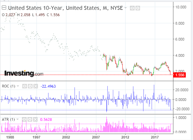
* UPDATED August 18...
This Zero Hedge article outlines why negative rates do not bode well for world economies, markets and more...
In this regard, the following daily chart of the MSCI World (ex USA) Index shows that price has dropped, once again, to just above the 1800 level.
The MACD histogram and RSI indicators are hinting that price is attempting to stabilize on this short-term timeframe and may reverse its decline that began in early July.
The following monthly chart of the MSCI World, Global (incl USA) Indexes shows that price is stuck at a triple-top formation, after failing to break out and hold above an all-time high set in January 2018.
The RSI, MOM and ROC indicators have yet to make a new swing high above those also set in January 2018.
In summary, keep an eye on both of these indices and short and longer term timeframes, along with their indicators, as well as US 10-Year Treasury yields and ROC and ATR indicators, for clues that world markets may, finally, be paying attention to negative effects of negative bond yields.
Once again, US 10-Year Treasury yields are approaching 60-year historical lows set in mid-2012 and mid-2016, as shown on the following monthly chart.

Shown on the next shorter-term monthly chart are the Rate-of-Change (ROC) and Average True Range (ATR) indicators (in histogram format and with an input value of one period).
Should this rate continue to fall, and, in particular, if it breaks and holds below the previous lows, I'd say that US equity markets would weaken considerably. In that regard, watch for accelerating larger spikes on both histograms for confirmation of further yield drops. Otherwise, watch for large sustained spikes to confirm a serious turnaround to the upside...with US equities strengthening.

* UPDATED August 18...
This Zero Hedge article outlines why negative rates do not bode well for world economies, markets and more...
 |
| Source: ZeroHedge.com |

In this regard, the following daily chart of the MSCI World (ex USA) Index shows that price has dropped, once again, to just above the 1800 level.
The MACD histogram and RSI indicators are hinting that price is attempting to stabilize on this short-term timeframe and may reverse its decline that began in early July.
The following monthly chart of the MSCI World, Global (incl USA) Indexes shows that price is stuck at a triple-top formation, after failing to break out and hold above an all-time high set in January 2018.
The RSI, MOM and ROC indicators have yet to make a new swing high above those also set in January 2018.
In summary, keep an eye on both of these indices and short and longer term timeframes, along with their indicators, as well as US 10-Year Treasury yields and ROC and ATR indicators, for clues that world markets may, finally, be paying attention to negative effects of negative bond yields.
What Does Dr. Copper Signal For Global Markets?
The following monthly chart of Copper shows that price is hovering above the apex of a very large long-term triangle.
Since early 2018, it hasn't been able to break out above the upper edge of this triangle, confirming the weakness that we've been seeing in global markets, to date. My last article summarizes this weakness in a nutshell.
I've shown the Rate-of-Change (ROC) and Average True Range (ATR) indicators in histogram format with an input value of one period. I'd watch for a series of larger spikes on each to signal, either serious and sustained buying, or a plunge to further lows (as another gauge to track global market strength/weakness). Otherwise, continued smaller spikes would accompany more range-bound, tepid trading in Copper, as well as global markets, in general.

Monday, August 12, 2019
World Market Weakness & Negative Yielding Debt
The following 1-year daily charts of major world markets show that some of them have broken below their mid-year lows, while others are close to a retest.

In the following two videos of BNN Bloomberg's August 9 interview with David Prince, it's clear that market weakness is not President Trump's fault, in spite of what many media pundits would have you believe.
As David outlines, there are many factors at play, contributing to economic slowdown, that are affecting markets worldwide.
Just glancing at the charts above, I'd say that if the remaining markets break and hold below their mid-year lows, we'll likely see an escalation of, not only worldwide market weakness, but also economic weakness...potentially leading to a recession in the not-too-distant future.
N.B. If you can't see or play these videos, you can find them here and here, respectively.

In the following two videos of BNN Bloomberg's August 9 interview with David Prince, it's clear that market weakness is not President Trump's fault, in spite of what many media pundits would have you believe.
As David outlines, there are many factors at play, contributing to economic slowdown, that are affecting markets worldwide.
"New records are being made, specifically with the value of negative-yielding debt (that you basically pay to own) now screeching to $15 Trillion worldwide."
Just glancing at the charts above, I'd say that if the remaining markets break and hold below their mid-year lows, we'll likely see an escalation of, not only worldwide market weakness, but also economic weakness...potentially leading to a recession in the not-too-distant future.
N.B. If you can't see or play these videos, you can find them here and here, respectively.
Monday, August 05, 2019

Trade War Battles Escalate As The Alligator Bites
My post of July 14 discussed the trade war between China and the US and the effects it was having on China, in particular. Since that date, I added several important updates on that post, which are definitely worth reading...the latest one was earlier today (Monday).
The following World Stock Markets heat map shows the major losses incurred by world markets at their respective closes today...not a pretty picture.

Volatility has ramped up significantly since July 26 and price closed on the following SPX:VIX monthly ratio chart well below the 150 Bull/Bear Line-in-the-Sand level at 115.69.
Price action on this ratio peaked in January 2018 and it has made a series of lower highs, which are clearly evident on the next three charts (depicting monthly, quarterly and yearly timeframes, respectively)...indicating that the successive rallies in the SPX were getting weaker.
A drop and hold below 100 on this ratio could produce an acceleration of the selloff, sending the SPX down to, at least 2600, or even 2400, as I described in one of my updates in the above-mentioned post.


A drop to 2600 would land price on the median of this long-term uptrending regression channel (after nearly tagging a target price of 3047 identified in my post of June 29), as shown on the following SPX monthly chart.

And, as I warned in my aforementioned post of June 29, the alligator formations on the YM, ES, NQ and RTY E-mini Futures Indices have now crossed, hinting of further weakness ahead.
Of note, is price relative to the 200-day MA (yellow). If we see an acceleration of selling to take the ES and NQ below it, I'd say that the SPX has a good chance of hitting 2600, or lower...watch for price to drop and hold below 100 on the SPX:VIX ratio for confirmation. Inasmuch as the YM and RTY are already below their 200 MA, we'll see if they can catch a sustainable bounce anytime soon to lead the other two back into recovery mode. Otherwise, look for the YM and RTY to lead the others in a continued selloff.

Subscribe to:
Posts (Atom)