WELCOME

Welcome and thank you for visiting!

The charts, graphs and comments in my Trading Blog represent my technical analysis and observations of a variety of world markets...
* Major World Market Indices * Futures Markets * U.S. Sectors and ETFs * Commodities * U.S. Bonds * Forex

N.B.
* The content in my articles is time-sensitive. Each one shows the date and time (New York ET) that I publish them. By the time you read them, market conditions may be quite different than that which is described in my posts, and upon which my analyses are based at that time.
* My posts are also re-published by several other websites and I have no control as to when their editors do so, or for the accuracy in their editing and reproduction of my content.
* In answer to this often-asked question, please be advised that I do not post articles from other writers on my site.
* From time to time, I will add updated market information and charts to some of my articles, so it's worth checking back here occasionally for the latest analyses.

DISCLAIMER: All the information contained within my posts are my opinions only and none of it may be construed as financial or trading advice...please read my full Disclaimer at this link.

Dots

* If the dots don't connect, gather more dots until they do...or, just follow the $$$...

Convertible at Beach

Convertible at Beach

ECONOMIC EVENTS

UPCOMING (MAJOR) U.S. ECONOMIC EVENTS...

***2026***
* Wed. Sept. 16 @ 2:00 pm ET - FOMC Rate Announcement and @ 2:30 pm ET - Fed Chair Press Conference

*** CLICK HERE for link to Economic Calendars for all upcoming events.

Showing posts with label Yearly Market Wrap-Up. Show all posts

Monday, January 17, 2022

Death Cross Forms On SPX:VIX Ratio

I last wrote about the SPX in my 2021 Market Wrap-Up and 2022 Forecast on January 1.

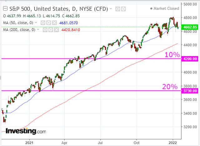
The SPX closed (around 20 points below the 50-day moving average) at 4662.85 last Friday, as shown on the following daily chart. The 200-day moving average is well below at 4420.84, which is slightly above the yearly Pivot Point for 2022 of 4412.61 (identified in my above-mentioned post). Both moving averages are still in uptrend.

The SPX uptrend is wavering and price is caught in a large and tightly bunched-up consolidation range.


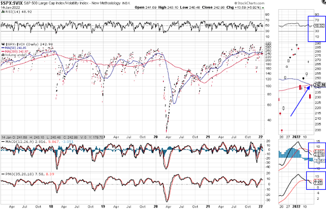
A 50/200-day moving average Death Cross just formed on the SPX:VIX Ratio, as shown on the daily ratio chart below...at variance with the moving averages on the SPX.

It's a warning signal that weakness has crept into the SPX and we may see it pull back or correct soon.

A 10% drop would send it down to 4200, while a 20% drop would take it to 3730.

Alternatively, it may be a bear trap.

These two scenarios should become more clearly defined after the next Fed meeting on January 26.

In the meantime, trading will likely remain volatile and whippy...especially below 4700.


Saturday, January 01, 2022

2021 Market Wrap-Up and 2022 Forecast

My 2020 Market Wrap-Up and 2021 Market Forecast can be found at this link.

After witnessing an unusual number of wild parabolic spikes and plunges on a variety of trading instruments during 2021, I'd posit that 2022 will see a return to a state of quasi-rationality... out of necessity in order to preserve one's remaining stash of cash

BUT, this will create higher volatility, lower volumes, lower trend sustainability, longer periods of consolidation, lower expectations, and lower certainty, overall.

2022 will be hung over with higher (persistent) inflation, COVID-19 variants and accompanying economic disruptions, increased interest rates, a changing political landscape, increasing national and international security concerns, and a skyrocketing national debt, to name a few headwinds.

In fact, it may very well feel like market makers/movers and shakers have you "on hold" at times.

There will be surprises, some quite shocking (to markets) if/when they become common knowledge.

"Don't think money does everything,
or you are going to end up
doing everything for money."
-- Voltaire

At its height, the SPX gained around 29.5% for 2021. Assuming we do see quasi-rationality take hold, we could expect to see a gain of around half of that in 2022 -- a 16%+/- increase by year end -- IF the tailwinds outweigh the headwinds

Its trading range for 2021 was 1,146.22 points, with a high of 4808.93 and a low of 3662.71, as shown on the following yearly chart.

The following Pivot Point calculations are provided to illustrate a variety of support and resistance levels/price targets on the yearly timeframe for the SPX. They are based on the high/low/close of the 2021 candle for 2022's levels/price targets.

The Pivot Point of 4412.61 for 2022 (identified below) is one and the same as the Pivot Point depicted on the 2021 yearly candle in the chart above (small horizontal white line). It will act as a major support/resistance level for 2022, with R1/R2/R3 acting as minor resistance and S1/S2/S3 acting as minor support levels.

If the SPX sees a gain of around 16% for 2022 from 2021's close of 4766.18, it may reach a high of 5528.80. That price is just 30 points shy of the R2 target at 5558.83.

However, if it falls and holds below the Pivot Point at 4412.61, we could see a catastrophic plunge ensue in the equity markets...and markets worldwide.

In conclusion, look for more stable and valuable sectors and stocks, commodities, bonds, and currencies which, potentially, may act as a safer hedge against the headwinds (and, as yet, unrevealed shocking surprises) described above.

BUT, keep your wise wits about you!

"If there is no wisdom,
rationality can be very dangerous."
-- Nirmala Srivastava

~~~~~~~

Happy New Year and best of luck in 2022!

~~~~~~~

* UPDATE January 5...

It appears that the Fed is confirming many of my 2022 "hangover" assessments, as outlined in their minutes released today from their last meeting. 

As I write this update at 2:30 pm ET, the SPX is currently selling off, but remains above the upper edge (4700) of a sideways consolidation zone that began last November...now considered minor support

A drop and hold below 4700 will see a return to a trendless, whippy and volatile market until it breaks and holds below 4500.


* UPDATE January 7...

The US 10-year treasury yield (US10YT) has spiked upward since the beginning of this year, as shown on the monthly chart below...confirming Fed sentiment described above.

It's now well above major support of 1.50 and is on its way to 2.00...or higher.

And, there's this report pertaining to yields...

* UPDATE January 8...

The following article provides a good explanation of how we got to the point of inflation headaches for the Fed...and where things are headed...(HINT: bad news for consumers)...

* UPDATE January 12...

Inflation has gone vertical over the past two years, as has the SPX...looks like a correlation to me.

CPI (Consumer Price Index) came in at 7.0% today.

By the way, inflation has spiked way above what it was just prior to the 2008/09 financial crisis.

If that's not a warning to traders, I don't know what is! 😕

And, it's bad news for President Biden and his far-left spending agenda/spree. 

So, what will he do for the next three years of his first term that will benefit all Americans?

Unless he shifts radically away from his socialist agenda and unconstitutional mandates and moves toward a centrist stance, he will be hamstrung by factors such as spiking inflation and plummeting poll numbers (currently in the low 30s).

So, brace yourselves for stagflation until the 2024 election.


Zerohedge excerpt


Sunday, January 03, 2021

2020 Market Wrap-Up and 2021 Market Forecast: A Dimmer Sun?

Perhaps the most valuable commodity this year will be Vitamin D, thanks to Bill Gates' proposal to "dim the sun" and his support for large-scale, endless lockdowns. 😏

My Annual 2020 Market Wrap-Up and 2021 Market Forecast is extremely short this year. We live in an upside-down world, propped up by central banks and government stimulus...likely to continue this year, thanks to the effects of the COVID-19 global pandemic.


The S&P 500 Index (SPX) gained a total of 1,568.34 points from the low to the high of 2020, and the Balance of Power (BOP) is still firmly in the hands of Buyers, as shown on the following monthly chart

However, the BOP for December is a fraction below November's, so the buying was slightly more subdued last month and may portend a slower pace in the coming months.

The next major resistance is represented by the 1.382% External Fibonacci level at 3850.57. Major support lies below at the "Big Round Number" of 3600.

Barring another retest of 3600, as we saw during three weeks of November, I'd expect the buying to continue up to 3850.57, or higher, in the coming weeks/months.

However, stocks may be getting overvalued, as shown on the following ZeroHedge chart. Perhaps 2021 may usher in more stock splits...or a 10-20% correction.

We'll see what happens...but, keep an eye on the rate of buying/selling, as represented by the BOP indicator.


P.S.

By the way, the SPX "iceberg" is still afloat.


Sunday, December 29, 2019

SPX: What's In Store For The 2020s & 2030s?

THE LONG VIEW INTO THE FUTURE...


Each candle on the following chart of the SPX represents a period of one year.

From 1932 to 1972, it, essentially, rallied for 40 years, particularly for the latter 30 years. From 1974 to 2000, its bull run lasted for 26 years. For the past 10 years, it's also been in a strong bull market.

Very simply, history shows that, for the most part, the SPX has been a strong (BUY) candidate for longer-term investors over an average of 30 years running, and that is likely to be repeated for another 10-20 years, generally speaking.


As I write this post on December 28 (with only 2 trading days left in 2019), the following monthly chart of the SPX shows that it has gained 340% from its March 2009 lows.

The Balance of Power is currently under the control of buyers and has yet to match prior highs...hinting of further upside potential for 2020.

Furthermore, if the 2020s are as strong as the 2010s, look for a similar percentage gain through to 2030...and, possibly again to 2040...before we eventually see a meaningful pullback/consolidation for, perhaps, 10 years through to 2050.


As long as the Technology Sector (Nasdaq Composite Index) remains strong through 2020, as I wrote in my post of December 26, no doubt that will bode well for the SPX.

The following monthly chart shows a gain of 554% for the past 10 years. The gains in the tech sector have outpaced the U.S. markets, in general. That is likely to continue and, possibly, strengthen over the next 10 to 20 years as innovation accelerates...buoying the rest of the markets, in turn...one to watch!


N.B. By the way, the SPX managed to hit my Q4 target of 3233 by the end of this year, as I forecast in my post of September 29...(the monthly chart below is from that post).


P.S. So, as I asked in my post of December 24 [one-day $34.4 Billion U.S. retail sales and $17 Trillion global market gains (21.68%) this year], "What's not to like, Joe?"

Happy New Year!

* UPDATE Feb. 5, 2023...

From the date this article was posted, the SPX rallied another 1,600 points to a high of 4817.88 by January 2022, as shown on the following monthly chart.

It, subsequently, pulled back to a low of 3490 by October 2022 and has rallied somewhat to 4136.48.

The monthly timeframe is still in a technical downtrend and price action during 2022 has been very choppy and volatile, producing very large daily, weekly and monthly swings.

I analyzed a number of markets in my 2023 Market Forecast and came to the following conclusions...

So, where the SPX goes from here, is anybody's guess...for now...but, I have a feeling that the volatility, choppiness, and large-scale swings have not yet disappeared. 

And, with Joe Biden as the current President (since January 2021), I'm sure that those conditions will persist for, at least, the rest of 2023...and, possibly, until the end of his first term in January 2025.

And, as I concluded in my aforementioned forecast, the SPX may drop to 3200, or lower, either before the end of this year, or by the end of Biden's first term...BEFORE we see the SPX resume its historical BULL RUN into the end of the 2020s and 2030s.

* UPDATE January 24, 2025...

To read the latest update, see my new post entitled SPX: What's In Store From 2025 To 2029?


Tuesday, January 01, 2019

2018 Market Wrap-Up: Extreme Volatility

The following charts depict 2018 market action in the S&P 500 Index (SPX), as well as the MSCI World Index. One word describes 2018 markets...volatile.

Volatility was extreme, as uncertainty gripped, not only U.S. markets, but markets world-wide, as well, as I had posited in my 2018 Market Forecast at the end of 2017. I believe it will continue to apply in 2019, and we'll see a world market slowdown, as I described in my 2019 Market Forecast.

Key levels that I'm watching on the SPX are 2600, 2400, 2250 and 2000, as illustrated in my post of December 27.

Market gauges that I'm monitoring in the weeks/months ahead are outlined in the above-mentioned posts, as the charts below are simply presented without comment (on the SPX) to depict this volatile price action.

Happy New Year and best of luck in 2019!

SPX -- Each candle on the  following chart represents a period of one year.


SPX -- Each candle on the  following chart represents a period of one quarter.


SPX -- Each candle on the  following chart represents a period of one month.


SPX:VIX Ratio -- Each candle on the  following ratio chart represents a period of one year.


SPX:VIX Ratio -- Each candle on the  following ratio chart represents a period of one quarter.

 
SPX:VIX Ratio -- Each candle on the  following ratio chart represents a period of one month.


MSCI World Index -- Each candle on the following chart represents a period of one week.

N.B. 1800 is a critical level, as a break and hold below will drag U.S. equities down, as well. It was briefly pierced during the last week of December and may be retested before, either resuming its plunge, or reversing course.

A tepid reversal will not produce lasting confidence or commitment in world markets, nor sustain a meaningful longer-term rally. In this regard, I've shown the input value as "one" on the three technical indicators (MOM, ROC and ATR) to illustrate and gauge the strength and velocity of either direction.


Saturday, December 30, 2017

2017 Market Wrap-Up

This post will outline how the U.S. Major  Indices, Major SectorsS&P 500 Index and the SPX:VIX Ratio performed throughout 2017 and how they ended the year.

U.S. MAJOR INDICES


The following 1-year daily charts and year-to-date percentage-gained/lost graph show that all Major Indices, except Utilities, are trading well above their 50-day moving average, and that Technology made the most gains, followed by Transports, Large-Caps, Small Caps, and, Utilities.


MAJOR SECTORS


The following 1-year daily charts and year-to-date percentage-gained/lost graph show that all Major Sectors, except Utilities, are also trading above their 50-day moving average, and that Technology gained the most, followed by Materials, Industrials, Consumer Cyclicals, Financials, Health Care, Consumer Staples and Utilities, while Energy ended, essentially, flat, at -0.89%.


S&P 500 INDEX


The following four charts of the S&P 500 Index will depict how 2017 ended, on a yearly, quarterly, monthly, and weekly basis.

Each candle on the following chart represents a period of one year.

2017 extended gains made in 2016, mostly remained above 2250, and finished the year on an extremely bullish candle. Momentum hit an all-time high on this timeframe by year-end.


Each candle on the following chart represents a period of one quarter.

Each of the four 2017 quarters gained on the prior one, without much of a pullback in each. Momentum has yet to make a new swing high on this timeframe since it peaked in 2014.


Each candle on the following chart represents a period of one month.

With the exception of March, each candle closed higher, with a bit more candle overlap. Momentum also closed out the year at an all-time high on this timeframe.


Each candle on the following chart represents a period of one week.

There are several minor pullbacks evident throughout 2017 and some profits were taken in the last two weeks. Momentum dipped a couple of times, but remained above zero, and ended in strong uptrend.


SPX:VIX RATIO


The following four charts of the SPX:VIX Ratio will depict how 2017 ended, on a yearly, quarterly, monthly, and weekly basis.

Each candle on the following chart represents a period of one year.

2017 extended gains made in 2016, and finished the year on an extremely bullish candle (illustrating low volatility), as it closed about 20 points off its all-time high. Momentum hit an all-time high on this timeframe by year-end.


Each candle on the following chart represents a period of one quarter.

Volatility rose on this timeframe, as evidenced by the long tailed candles, as price remained, essentially, above 150. All candles, except Q4, closed higher. Momentum hit an all-time high in Q3 and remains strong.


Each candle on the following chart represents a period of one month.

Half of the 12 candles closed higher (on moderate volatility), but the general trend is still up. Momentum is still in strong uptrend on this timeframe, as an all-time swing high was made in October.


Each candle on the following chart represents a period of one week.

Zigzag price action illustrates higher volatility on this timeframe, as some profit-taking occurred several times this year, but remains in uptrend. Momentum closed the year below zero, after spiking to an all-time high at the end of October.


SUPPORT & RESISTANCE LEVELS


SPX

The SPX is mashed up against major resistance in the form of an external Fibonacci retracement level, as shown on the Monthly chart below. It's also trading above a +2 standard deviation level of a long-term uptrending Regression Channel (formerly major resistance/now support around 2600).

Such a channel breakout has not occurred since it began at its lows of 2009, so any further buying that occurs at/above these levels would be unusual and, potentially, lead to over-exuberant parabolic spikes.

The next major support level sits at 2485 (a confluence of two external Fibonacci retracement levels and the +1 channel deviation level. A pullback of 7% from its 2017 closing price of 2673 would send it down to that level.


SPX:VIX Ratio

Price on the following Monthly ratio chart of SPX:VIX closed in the lower half of the long-term uptrending (green) channel.

It will be important for price on this ratio to reach and hold above the 280 major resistance level, and for the SPX to hold above its near-term 2600 major support level, in support of a convincing argument that favours the sustained entry of the SPX into a new bull-market phase.

Otherwise, if price drops and holds below major support at 200, expect volatility to increase dramatically and weakness to set in on the SPX.


CONCLUSIONS


2017 was a year of low to moderate volatility (depending on the timeframe), but managed to generate steady quarterly gains in the SPX through to year-end. In last year's Market Forecast for 2017, I had anticipated an increase of around 11% in equities, in general, as well as low volatility. In fact, the S&P 500 Index closed out the year 19.42% higher (20.16% at its highest for the year on December 18).

Technology and Large Caps led the markets to new highs throughout the year (supported by a strong Financials sector), while Small Caps made modest gains, in comparison.

Next year's U.S. mid-term Congressional election, coupled with two to three possible interest rate hikes, will likely generate an increase in market uncertainty and volatility. So, we may see larger weekly swings occur, and, possibly, a 7% pullback at some point, to generate an overall increase of about half of what we saw in 2017...to propel the SPX approximately 10% higher to around 2940 by year-end.

A LOOK INTO THE FUTURE


In closing, I'd mention that my Market Forecast for 2018 can be found at this link for further details. Since writing that post, the following record-breaking news arose:

  • The S&P 500 Index came within 5 points of hitting 2,700 and the Nasdaq Composite Index hit 7,000 on December 18. In my post of November 26, 2016, I had projected an SPX target of 2,700 (in anticipation of the 2020 Presidential election), so, to see it nearly hit three years early illustrates what an unusually strong year this has been).
  • President Trump signed the Tax Cuts and Jobs Act on December 22 (the new lower corporate rate of 21% will take effect January 2018). Following this, many major companies announced pay raises and bonuses for employees, as well as plans to hire more workers and increase infrastructure spending.


  • Of course, I realize that a forecast is, simply, one possibility of many. However, it can be a useful tool in order to track, assess and learn from one's future successes and failures on a short, medium and long-term basis. And, it can be modified/updated during its duration, depending on world and domestic influences at the time.

    I wish you good health and prosperity in 2018!


    Happy New Year 2018!