WELCOME

Welcome and thank you for visiting!

The charts, graphs and comments in my Trading Blog represent my technical analysis and observations of a variety of world markets...
* Major World Market Indices * Futures Markets * U.S. Sectors and ETFs * Commodities * U.S. Bonds * Forex

N.B.
* The content in my articles is time-sensitive. Each one shows the date and time (New York ET) that I publish them. By the time you read them, market conditions may be quite different than that which is described in my posts, and upon which my analyses are based at that time.
* My posts are also re-published by several other websites and I have no control as to when their editors do so, or for the accuracy in their editing and reproduction of my content.
* In answer to this often-asked question, please be advised that I do not post articles from other writers on my site.
* From time to time, I will add updated market information and charts to some of my articles, so it's worth checking back here occasionally for the latest analyses.

DISCLAIMER: All the information contained within my posts are my opinions only and none of it may be construed as financial or trading advice...please read my full Disclaimer at this link.

Dots

* If the dots don't connect, gather more dots until they do...or, just follow the $$$...

Beach Drinks

Beach Drinks

ECONOMIC EVENTS

UPCOMING (MAJOR) U.S. ECONOMIC EVENTS...

***2026***
* Wed. June 17 @ 2:00 pm ET - FOMC Rate Announcement + Forecasts and @ 2:30 pm ET - Fed Chair Press Conference

*** CLICK HERE for link to Economic Calendars for all upcoming events.

Saturday, October 28, 2017

Spain's Ibex 35 Index Mired in Long-Term Congestion Zone

In the midst of political and social uncertainty surrounding the recent referendum in Catalonia to separate from the rest of Spain and Prime Minister Rajoy's aim to stop it, Spain's Ibex 35 Index has been faltering, as shown on both the longer-term Monthly chart and the short-term Daily chart below.

Longer term, price ran into major resistance in the form of a downtrend line and a 50% Fib retracement level. It's currently hovering above the 40% Fib level. So far, neither the Momentum nor the ROC indicators are showing that higher prices are in store for this index on this timeframe.

Shorter term, a bearish moving average Death Cross has formed and price closed just below both of them on Friday. So far, the RSI, MACD and PMO indicators are not hinting of higher prices to come any time soon.

These technical indicators, resistance and support levels, together with the Death Cross formation, may be monitored to assist in determining the potential sustainability of any further decline or new rally that may ensue over both the short term and the longer term. A drop and hold below the long-term triangle apex at 9150 could produce a swift plunge to 7750, or lower.


Wednesday, October 25, 2017

New "SELL" Signal Triggered on Weekly SPX:VIX Ratio

I last wrote about the SPX:VIX ratio in my post of October 17. At the time, volatility was creeping higher, as the SPX was making new highs.

As of 2:00 pm today (Wednesday), volatility has continued to rise, as the ratio dropped to just above the critical 200 "New Bull Market" level, as shown on the following SPX:VIX Monthly ratio chart.


The following 60-Day 60-minute ratio chart shows that, although one gap up has been filled, there are two unfilled gaps remaining, dating back to September 11.


A new "SELL" signal has just triggered on the Weekly ratio, as shown below.


The SPX nearly reached a potential target of 2600 on Monday, as shown on the following Daily chart, where it will encounter major resistance in the form of a +2 deviation level of a very long-term regression channel, as I outlined in my above-mentioned post.


Keep an eye on these charts, especially the 60-Day 60-minute, to see if the prior gaps are filled, and whether the ratio drops and holds below 200. If so, expect volatility to increase as weakness sets in on the SPX. If not, the SPX may try, again, to reach 2600, before such a scenario may develop.

In any event, the SPX may whipsaw until after the next Fed meeting concludes on November 1, before it, either continues to advance to new highs, or we see a pullback, and gap fills on the intraday ratio.

Friday, October 20, 2017

BITCOIN: The Extreme Anomaly

* See UPDATE below...

After plunging to 3000 six weeks ago, Bitcoin snapped back and reached 6000+ today (a 100% increase during that time), as shown on the following Monthly chart, and, as noted in my last post (originally written on September 4th and updated periodically, with comments and charts, to, and including, today).


What strikes me as extraordinary is to see the percentage gained Year-to-date of Bitcoin (527.07%) compared to the U.S. Major Indices, as shown on the following graph.

I find this noteworthy and very unusual, to say the least, inasmuch as it's not "backed up by" or "pegged to" anything.


And, here's a look at the all-time percentage gains for Bitcoin, since it was first listed on the NYSE on May 19, 2015...2417.70%...

Is this an unsustainable parabolic bubble in the making? We'll see...


If Satoshi Nakamoto, the man believed to have created and implemented Bitcoin, still holds 1,000,000 Bitcoin, he'd be $6 Billion richer today:
https://en.wikipedia.org/wiki/Satoshi_Nakamoto


* UPDATE November 2...

Another 1300 points tacked on in the past 9 days as it ploughed through the 7000 level...the manic euphoria continues...


Tuesday, October 17, 2017

Will the SPX Reach 2600?

I last wrote about the SPX:VIX ratio on September 30.

Price action on the Monthly ratio chart below shows an inability, so far, for volatility to be held at bay, while the SPX continues to make new highs, almost daily.

It has failed to hold, with conviction, above the 250 level and advance above its next resistance level, which is a 161.8% external Fibonacci level at 280.


Price action, typically, doesn't like to leave unfilled gaps on the 60-Day 60-minute ratio chart. It gapped up on September 11 and remains unfilled. I'd expect that it will be filled in the near term, inasmuch as momentum has been fading on this timeframe and it has dropped below zero, once again. Watch for momentum to remain below zero on any gap fill.

Should price drop and hold below 200, we could see a significant drop occur in the SPX. Keep an eye on momentum on this timeframe for any confirmation of such a move.


One possible scenario that may occur (before any such gap fill) is for the SPX to make a last gasp to reach 2600 (a +2 deviation level of a very long-term regression channel), as shown on the Monthly chart below.

Keep an eye on momentum on the above chart to see if it pops back, and holds, above zero to confirm that such a rally may be imminent.


Friday, October 13, 2017

Amazon Musings...

Will Amazon (AMZN) follow in the (recently fateful) footsteps of Equifax (EFX)? Note the similarities in their price action over the past five years (until EFX began its plunge on September 8)...


Sunday, October 01, 2017

FAANG Rotation: Risk On or Risk Off for Q4?

I last wrote about the five FAANG Tech stocks at the end of June.

Since then, we've seen rotation in and out of these stocks, as depicted on the following four percentage gained/lost graphs of varying lengths of time...namely, Year-to-date, 2017 Q3, the month of September, and the past week, respectively.


They are all still stuck in their large sideways trading ranges -- and Amazon and Apple are trading below their 50-day moving average -- as shown on the following 1-Year daily charts. All of them have formed some kind of topping formation, especially Amazon, which has formed a bearish Head & Shoulders pattern.

Watch for a break and hold, firstly, below their 50-day moving averages, and, then, a break and hold below their support levels, on escalating volumes, as a signal that traders are running from risk in Q4. Otherwise, renewed strength in these stocks, with increasing volume support, will indicate the market's continued overreach for growth versus value, at least until the end of the year when we may see the Fed hike interest rates for the third time this year.

Additional information can be found in my last post here (that details what may lie ahead for equities, in general, in Q4), which may or may not influence risk-appetite trading action (and vice versa) in the FAANGs.


Saturday, September 30, 2017

Third Down...One To Go: 2017 Q4 Looms for U.S. Equities

The following charts and graphs present a simplified birds-eye view of how the S&P 500 Index, and its volatility, performed in Q3 of 2017, as well as year-to-date.


But, first, a look at the Major Indices and 9 Major Sectors and how they have fared year-to-date and during Q3...

MAJOR INDICES

Eight of the nine Major Indices, namely, the Dow 30, Dow Transports, S&P 500, Nasdaq 100, Nasdaq Composite, Russell 2000, S&P 100, and Nasdaq Transportation Indices closed out Q3 at or near all-time highs, as shown on the following 1-Year Daily charts.


The following Year-to-date graph shows the percentages gained for the Major Indices.

The SPX has gained 12.53%, so far, this year. This exceeds my forecast of around an 11% gain for the entire year, as outlined in my post of December 1, 2016. The Dow 30 regained and held its footing above 22,000, and the SPX, OEX, and NDX reached their "Big Round Numbers" of 2500, 1100, and 6000, respectively, as I cited as a possibility on August 4.


The next graph shows the percentages gained during Q3 for these Major Indices.

Market players were willing to add more risk in the form of Small-cap stocks.


9 MAJOR SECTORS

Four of the nine Major Sectors closed out Q3 at or near their highs for the year, namely, Technology, Industrials, Materials, and Financials, as shown on the following 1-Year Daily charts.


Technology and Health Care have gained the most, so far, this year, followed by Industrials, Materials, Financials, Utilities, Cyclicals, and Consumer Staples, while Energy is -6.69%, as shown on the following Year-to-date graph.


The leader for Q3 of 2017 is Technology, followed by Energy, Materials, Financials, Industrials, Health Care, Utilities, Cyclicals, while Consumer Staples is -1.13%.


S&P 500 INDEX

Each candle on the following four charts of the SPX represents a period of one year, one quarter, one month, and one week, respectively.

Its price, at 2500, is now entangled in a web of triple major resistance in the form of a 27-year Fibonacci fanline, an 8-year Fibonacci fanline and an 8-year external Fibonacci retracement level.

The momentum indicator is presenting somewhat mixed signals on these timeframes...with the weekly, monthly and quarterly hinting of a possible buying slowdown, stagnation, or reversal looming in Q4.


SPX:VIX RATIO

Each candle on the following four charts of the SPX:VIX ratio represents a period of one yearone quarterone month, and one week, respectively. Price has closed near its all-time high and will be facing major channel and external Fib retracement resistance around the 280 level.

The momentum indicator is also presenting mixed signals on these timeframes...with the weekly and monthly hinting of possible higher volatility occuring in Q4. I recently wrote about higher volatility looming for Q4 here. Price will need to remain above 250 in the short term, and above the 200 New Bull Market level in the medium term, in order to confirm a sustainable upward bias for the SPX.


CONCLUSIONS

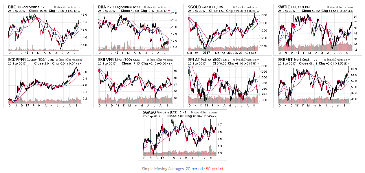
With both the SPX and SPX:VIX ratio at/near their all-time highs, and at or near long-term major resistance, technically, we could very well see some major profit-taking occur in equities, in general, in Q4, on increasing volatility, with a rotation into Commodities, the U.S. Dollar, Cyclicals, Consumer Staples, Utilities, and maybe Financials.

Watch for the SPX to either remain above 2500, or drop below...and for price on the SPX:VIX ratio to either remain above the 250 level, or drop below...to signal either continued low volatility, or an increase for Q4 of 2017.

Thursday, September 28, 2017

Abuse of Women at the Hands of Female Political Elites

Ladies...aren't you tired of the unrelenting verbal bashing, insults, harassment, guilt-trips, and downright mental abuse, heaped upon you by female political elites? They seem to think you don't have a mind of your own, or are even capable of sound reasoning...


Tuesday, September 26, 2017

Will the Dow Jones US Retail REITs Index Recover From Its 34% Decline?

After dramatically dropping 34% from its historical high of 151.85 from mid-2016 to a low of 99.98 in May of this year, the Dow Jones US Retail REITs Index has been stuck in a sideways trading range and is attempting to maintain a stable position above a long-term 40% Fib retracement level of 102.42, as shown on the following Monthly, Weekly and Daily charts.

Longer term, the Monthly momentum and rate of change technical indicators are hinting of further weakness.

In the medium term, the Weekly momentum and rate of change technical indicators are hinting of potential strength.

In the short term, the Daily RSI, MACD and PMO indicators are hinting of a possible new "BUY" signal forming...watch for the RSI to remain above 50, and for bullish crossovers to form on the MACD and PMO.

We'll see whether price, ultimately, breaks and holds above 110 to retest 121.31 (23% Fib retracement), or higher, or whether it breaks and holds below 102.42 to retest 94.00 (long-term major price support), or lower. Either way, watch for higher volumes on the upside or on the downside, to confirm direction in the coming days/weeks of Q4 of 2017.


Monday, September 25, 2017

A Volatile 2017 Q4 Awaits US Equities

Further to my post of September 25 (regarding GOP legislation failures), watch for an increase in volatility and a potential rotation out of equities (SPX) and into commodities (GOLD and OIL) and currencies (US Dollar) for Q4 of 2017.

With respect to volatility, watch for a potential "SELL" signal to form on the RSI, MACD and PMO technical indicators, as price whipsaws in between major resistance at 250 and major support at 200, as shown on the following SPX:VIX ratio chart.

SPX:VIX Daily Ratio chart

1-Year Daily charts of Commodity ETFs & Commodities

Year-to-date Percentages Gained/Lost graph of Commodity ETFs & Commodities

1-Year Daily charts of Major Currencies

Year-to-date Percentages Gained/Lost graph of Major Currencies